About the Client:
Duck is a coastal town with deep charm, loyal visitors, and a strong community spirit. The previous branding no longer represented the town’s progress or appeal. The new identity was created to honor Duck’s history while stepping confidently into a modern era. Clear branding helped the town communicate better, strengthen tourism efforts, and present a consistent identity across official platforms.
The Challenge
The old brand lacked flexibility and felt disconnected from the town’s personality.
It was not built for modern communication needs, from digital platforms to signage. Duck needed a scalable, consistent identity that represented who they were and where they were headed.
Our Approach
We analyzed the town’s culture, local textures, natural colors, and community values. The new logo and visual system draw inspiration from the coastal horizon, the flowing shoreline, and the warm energy that makes Duck memorable.
The identity balances nostalgia with a forward-looking approach, giving the town a brand that feels rooted and refreshed.. The goal was not to reinvent the town’s story, but to give it a stronger voice.
Scope and Key Deliverables
-
Logo and identity system
-
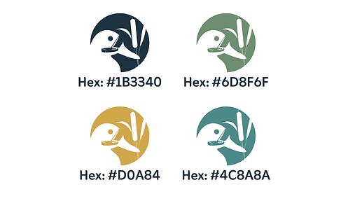
Color palette inspired by
coastal landscapes -
Typography and layout recommendations
-
Scalable assets for signage,
web, and tourism materials -
Visual direction for community engagement
The End Result:
Duck now has a cohesive identity that elevates its presence while honoring its roots. The brand supports tourism, strengthens communication, and helps the town show up with consistency across every touchpoint. It is a modern symbol of community, pride, and connection.

Primary Logo

Secondary Logo